LETTERS AS TEXTURE
Use letters of the alphabet–in the form of press-on type, type cut from magazine ads, or handwriting–in such a way that they lose their identity as letters and present, instead, a textural sensation.
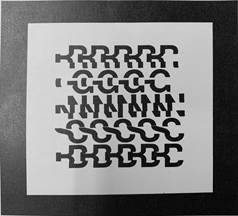
Letters are lines. Enlarged, they may become shapes. As illustrated below, many artists have also used letters to create textural effects. This problem gives you a chance to experiment along the same lines–to discover for yourself that letterforms can seem to rise off the page, creating visually the illusion of ridges you could feel with your hand.
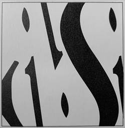
The letters could lose their identity by becoming part of something else, by being greatly enlarged (as shown in the image above), or greatly reduced, by being cut into unrecognizable bits (as in the image below), by being written illegibly, or by being repeated so many times that the viewer's first impression is one of texture. The examples shown here were done in black and white, with the high contrast between the two values helping to separate them spatially, as though the black lines were raised higher than the white background. This effect also works by association, because we are accustomed to seeing type as high areas that take ink and low areas that do not. Even in compositions with less value contrast–such as black letters against a brown groundsheet–letters can still be used texturally. The interest for the viewer lies partly in the illusion of a texture that could be felt and partly in the seeming possibility that they might be recognized or read if studied long enough.